
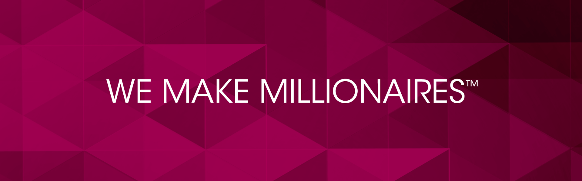
We Make Millionaires
Role
Art Direction • Brand Identity • Campaign Development • Visual Systems • Execution
Art Direction • Brand Identity • Campaign Development • Visual Systems • Execution
Overview
Developed a recruitment-focused brand and campaign system designed to position Proforma as a platform for scalable entrepreneurial growth while introducing OnlyProforma as a focused business development initiative within the broader Proforma ecosystem.
Developed a recruitment-focused brand and campaign system designed to position Proforma as a platform for scalable entrepreneurial growth while introducing OnlyProforma as a focused business development initiative within the broader Proforma ecosystem.
Challenge
Create a brand identity and campaign that leveraged Proforma’s existing recognition while differentiating OnlyProforma through a more focused, growth-driven positioning.
Create a brand identity and campaign that leveraged Proforma’s existing recognition while differentiating OnlyProforma through a more focused, growth-driven positioning.
Approach
Partnered with executive leadership to develop the OnlyProforma identity and translate the “We Make Millionaires” concept into a cohesive multi-channel campaign system. Built a visual language that balanced familiarity with distinction while supporting recruitment, sales, and marketing initiatives across print and digital touchpoints.
Partnered with executive leadership to develop the OnlyProforma identity and translate the “We Make Millionaires” concept into a cohesive multi-channel campaign system. Built a visual language that balanced familiarity with distinction while supporting recruitment, sales, and marketing initiatives across print and digital touchpoints.
Execution
Led art direction and execution across recruitment collateral, editorial layouts, social media, digital placements, landing pages, and sales materials. Developed scalable layout and storytelling systems to ensure consistency across channels and formats.
Led art direction and execution across recruitment collateral, editorial layouts, social media, digital placements, landing pages, and sales materials. Developed scalable layout and storytelling systems to ensure consistency across channels and formats.
Initial Explorations to Define Visual Direction
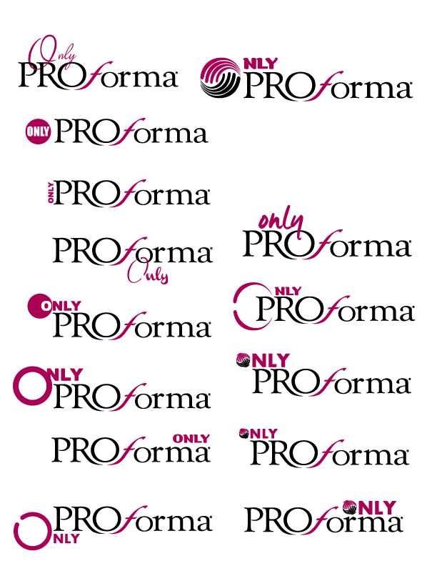
Iterations Refined Through CEO Feedback and Alignment
Approved Final Logo

Color Strategy:
Using Proforma’s signature colors was a deliberate decision to anchor OnlyProforma within the existing brand ecosystem. This consistency builds trust and familiarity, while the distinct logo execution signals a focused, growth-driven initiative.
Using Proforma’s signature colors was a deliberate decision to anchor OnlyProforma within the existing brand ecosystem. This consistency builds trust and familiarity, while the distinct logo execution signals a focused, growth-driven initiative.
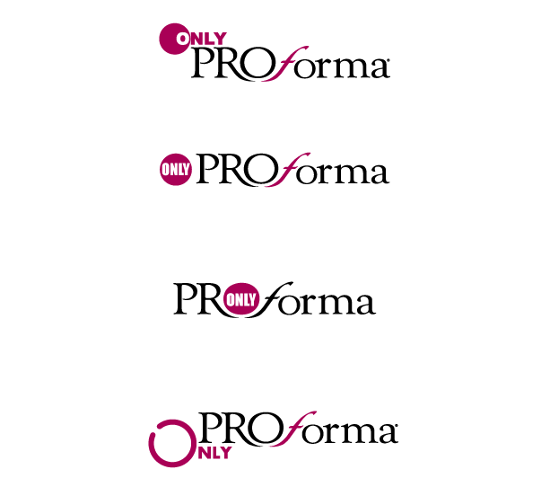
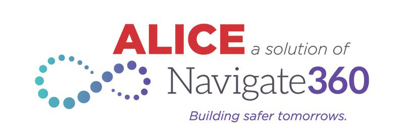
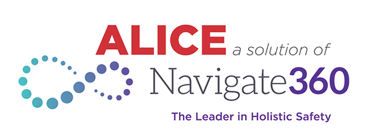
Logo System (Tagline Variations)


Evolving ALICE:
From Standalone Brand to Integrated Solution
From Standalone Brand to Integrated Solution
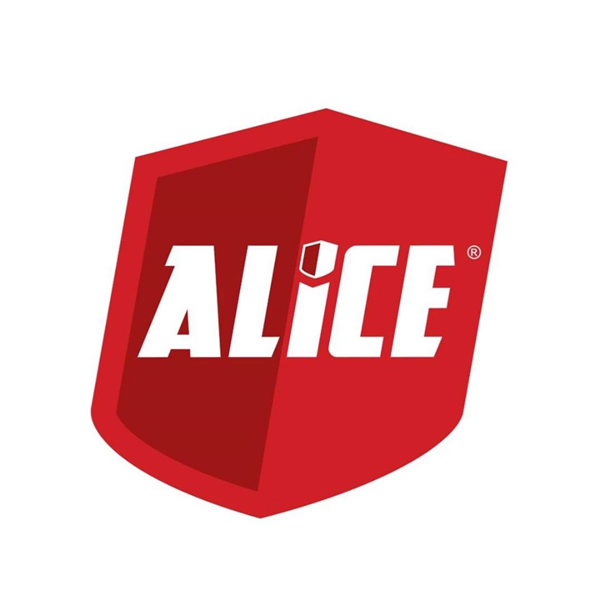
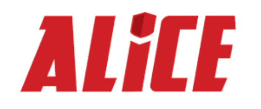
The original ALICE logo featured a bold, two-tone red shield that conveyed strength and protection, but visually felt heavy and disconnected from the broader Navigate360 brand system. Its standalone aesthetic created a sense of separation rather than integration within the parent brand.
Standalone Identity vs. Brand Ecosystem
Objective
Align the ALICE brand with the Navigate360 ecosystem to strengthen brand recognition, improve clarity of association, and create a more cohesive and scalable brand experience.
Align the ALICE brand with the Navigate360 ecosystem to strengthen brand recognition, improve clarity of association, and create a more cohesive and scalable brand experience.
Challenge
Originally developed as a standalone identity, ALICE lacked a clear visual connection to Navigate360. The bold, two-tone red shield conveyed strength and protection, but felt visually heavy and disconnected, limiting brand recognition and obscuring its relationship to the parent brand.
Originally developed as a standalone identity, ALICE lacked a clear visual connection to Navigate360. The bold, two-tone red shield conveyed strength and protection, but felt visually heavy and disconnected, limiting brand recognition and obscuring its relationship to the parent brand.
Approach
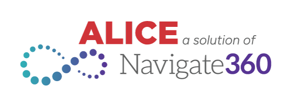
Redefined the brand to better integrate within the Navigate360 system while preserving ALICE’s core equity. Simplified the logo and introduced visual cues from the parent brand to create a more intuitive and unified identity. Maintained the use of ALICE red to preserve brand authority and recognition while evolving the system to support greater flexibility and scalability.
Redefined the brand to better integrate within the Navigate360 system while preserving ALICE’s core equity. Simplified the logo and introduced visual cues from the parent brand to create a more intuitive and unified identity. Maintained the use of ALICE red to preserve brand authority and recognition while evolving the system to support greater flexibility and scalability.

Announcement Video Introducing the New Logo Across Social Media and In-App for Existing Clients
Execution
Logo & System Integration
Refined the ALICE mark to align with Navigate360’s visual language, creating a stronger and more immediate association with the parent brand. Introduced the Navigate360 tagline in key applications, following established placement and typographic hierarchy to ensure consistency across touchpoints.
Refined the ALICE mark to align with Navigate360’s visual language, creating a stronger and more immediate association with the parent brand. Introduced the Navigate360 tagline in key applications, following established placement and typographic hierarchy to ensure consistency across touchpoints.
Visual Language Evolution
Shifted from angular layouts and sharp geometries to a more refined system using rounded shapes and softened containers. This evolution improved readability, flow, and overall user experience while supporting a more approachable, human-centered tone.
Shifted from angular layouts and sharp geometries to a more refined system using rounded shapes and softened containers. This evolution improved readability, flow, and overall user experience while supporting a more approachable, human-centered tone.
FIRST DESIGN
LATEST DESIGN

Color Strategy
Evolved the color system from heavy red and grey usage to a more intentional application. Used ALICE red strategically for headlines and key moments, while introducing Navigate360 orange and a transitional gradient to visually connect both brands and reduce visual weight.
Evolved the color system from heavy red and grey usage to a more intentional application. Used ALICE red strategically for headlines and key moments, while introducing Navigate360 orange and a transitional gradient to visually connect both brands and reduce visual weight.
Color Palette

Primary Brand Color
ALICE Red #cf3338
Used for headlines, key messaging, and high-impact moments.
ALICE Red #cf3338
Used for headlines, key messaging, and high-impact moments.
Secondary / Accent
Navigate360 Orange #f15e3e
Used to support calls to action and create warmth within layouts.
Navigate360 Orange #f15e3e
Used to support calls to action and create warmth within layouts.
Gradient Application
ALICE Red → Navigate360 Orange
A transitional gradient used to soften the visual system and connect both brands.
ALICE Red → Navigate360 Orange
A transitional gradient used to soften the visual system and connect both brands.
Neutrals
Dark Grey #54565b
Light Grey #e2e2e2
Used for body copy, backgrounds, and struct ure to maintain readability and balance.
Dark Grey #54565b
Light Grey #e2e2e2
Used for body copy, backgrounds, and struct ure to maintain readability and balance.
Outcome
Created a cohesive and scalable brand system that strengthened alignment with Navigate360, improved brand recognition, and delivered a more balanced experience that combines authority with accessibility across marketing and product touchpoints.
Created a cohesive and scalable brand system that strengthened alignment with Navigate360, improved brand recognition, and delivered a more balanced experience that combines authority with accessibility across marketing and product touchpoints.