
OnlyProforma
Building a Brand Within a Brand
Building a Brand Within a Brand

Objective
Create a distinct visual identity for OnlyProforma that could stand on its own while remaining clearly connected to the Proforma master brand. The goal was to establish a recognizable, flexible identity that could support marketing initiatives across digital, print, events, video, and sales communications.
Challenge
OnlyProforma needed its own personality without competing with or becoming disconnected from the established Proforma brand. The identity also had to work across a wide range of applications and audiences, while giving internal teams a consistent visual framework they could use as the brand expanded.
Approach
Developed a cohesive visual system around the OnlyProforma identity, defining typography, color, graphic elements, imagery, motion, and layout principles. Extended the system across campaigns, digital communications, presentations, events, video, and print, creating reusable templates and design frameworks that allowed the brand to remain recognizable while adapting to different content and formats.
Outcome
OnlyProforma evolved into a recognizable and scalable brand system with a consistent presence across marketing and communications. The framework gave business development teams greater flexibility to create new materials while maintaining visual continuity, strengthening the connection between individual touchpoints and the larger OnlyProforma brand experience.


Evolving ALICE:
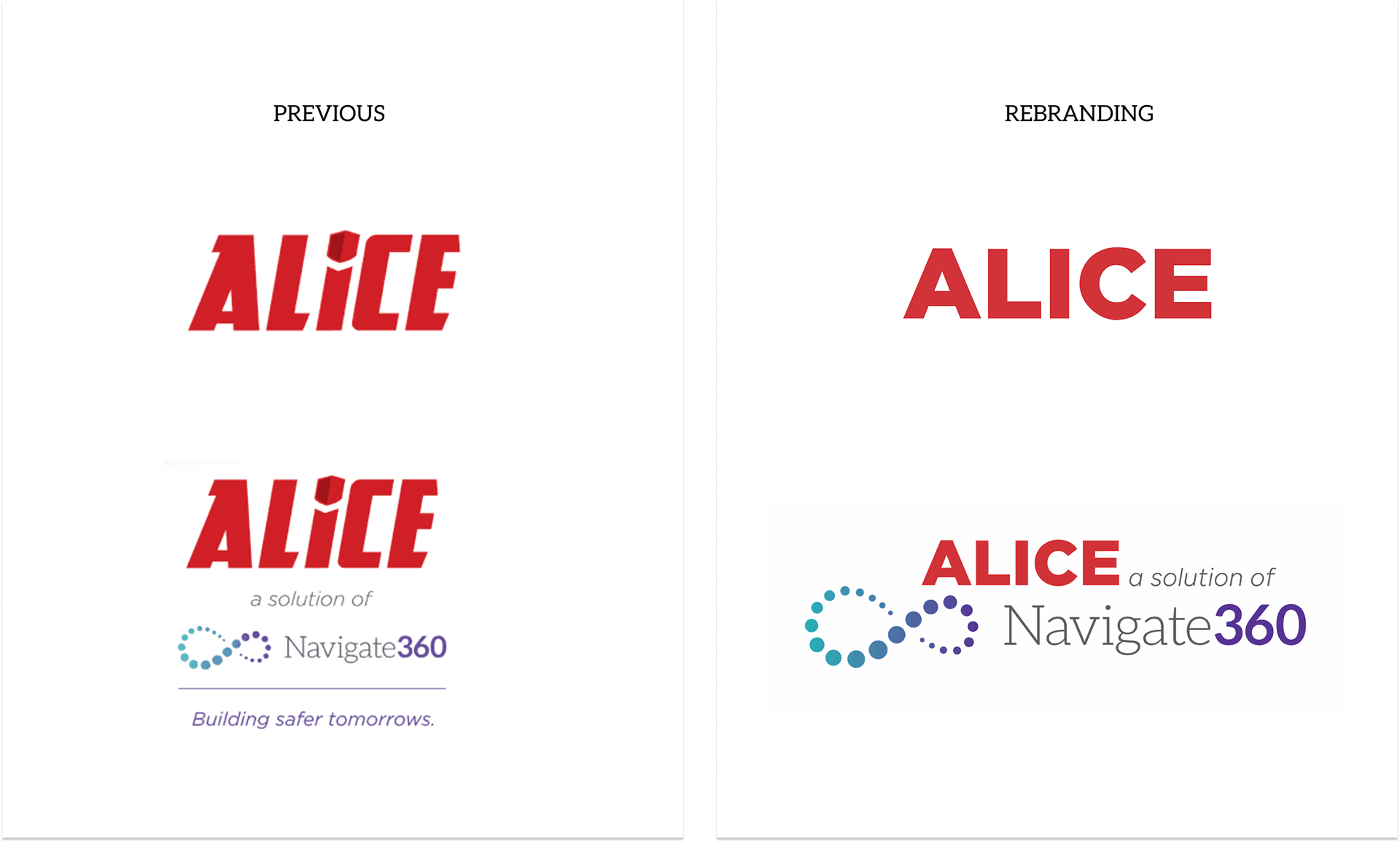
From Standalone Brand to Integrated Solution
From Standalone Brand to Integrated Solution

Objective
Align the ALICE brand with the Navigate360 ecosystem to strengthen brand recognition, improve clarity of association, and create a more cohesive and scalable brand experience.
Align the ALICE brand with the Navigate360 ecosystem to strengthen brand recognition, improve clarity of association, and create a more cohesive and scalable brand experience.
Challenge
Originally developed as a standalone identity, ALICE lacked a clear visual connection to Navigate360.
Originally developed as a standalone identity, ALICE lacked a clear visual connection to Navigate360.
Approach
Redefined the brand to better integrate within the Navigate360 system while preserving ALICE’s core equity. Simplified the logo and introduced visual cues from the parent brand to create a more intuitive and unified identity. Maintained the use of ALICE red to preserve brand authority and recognition while evolving the system to support greater flexibility and scalability.
Redefined the brand to better integrate within the Navigate360 system while preserving ALICE’s core equity. Simplified the logo and introduced visual cues from the parent brand to create a more intuitive and unified identity. Maintained the use of ALICE red to preserve brand authority and recognition while evolving the system to support greater flexibility and scalability.
Outcome
Created a cohesive and scalable brand system that strengthened alignment with Navigate360, improved brand recognition, and delivered a more balanced experience that combines authority with accessibility across marketing and product touchpoints.
Created a cohesive and scalable brand system that strengthened alignment with Navigate360, improved brand recognition, and delivered a more balanced experience that combines authority with accessibility across marketing and product touchpoints.


Primary Brand Color
ALICE Red #cf3338
Used for headlines, key messaging, and high-impact moments.
ALICE Red #cf3338
Used for headlines, key messaging, and high-impact moments.
Secondary / Accent
Navigate360 Orange #f15e3e
Used to support calls to action and create warmth within layouts.
Navigate360 Orange #f15e3e
Used to support calls to action and create warmth within layouts.
Gradient Application
ALICE Red → Navigate360 Orange
A transitional gradient used to soften the visual system and connect both brands.
ALICE Red → Navigate360 Orange
A transitional gradient used to soften the visual system and connect both brands.
Neutrals
Dark Grey #54565b
Light Grey #e2e2e2
Used for body copy, backgrounds, and structure to maintain readability and balance.
Dark Grey #54565b
Light Grey #e2e2e2
Used for body copy, backgrounds, and structure to maintain readability and balance.


Announcement Video Introducing the New Logo Across Social Media and In-App for Existing Clients


